Photo Editing Colour Spaces
:: Monday, October 8th, 2007 @ 1:49 pm
I know this is probably not a subject that most people care about and even less want to read about, but I have come across a situation where I feel the need to clarify what most professional photographers already know. I was recently asked to ‘proof’ a collection of pictures online… after viewing over 1000 images I was flat out depressed! The saturation levels for all the images were way too high… at least that’s what it looked like on the three different monitors I use for digital photo editing. “How could that be” you ask…!?!
In the world of computer graphics and digital photography, all computer monitors and working color spaces are not created equally. Let me reemphasize this… just because a jpeg (compressed image file) looks good on your color computer monitor at home, that doesn’t mean that it is going to look good on mine. Hell, what you see on your screen may look completely different once you print it out on that expensive new photo printer you just bought! Why… you ask? Because most people don’t calibrate & profile their output devices for color… that’s why!
Just as no two computer monitors are completely alike you must also understand that every monitor’s default profile is different as well. So unless two monitors are calibrated by the same person with the same calibration equipment using the same ICC profile and are of the same design they are not going to show color and contrast exactly the same. To help fix this problem, the Web has a standardized Colour Gamut known as sRGB (standard Red, Green, Blue), more on this and device color space later, but first a little background on workflow.
When a photographer takes a picture with a digital camera, he/she normally has to do some kind of editing to the image file before it is ready for publication, weather it be a JPEG, TIFF or RAW file. This editing is done with a photo editing software like Adobe Photoshop or Apple Aperture. This editing platform is what we photographers like to refer to as our ‘digital darkroom’ and in our darkroom we have a working space where we edit our images. I know your thinking this is dragging on, but please bare with me… I do have a point, I promise!!
The photo editing software allows the user to select which working color space or color gamut they want to work in during the photo editing process. This is what determines the color range you can work in. The editing color spaces most widely used by photographers are Adobe RGB, sRGB or ProPhoto RGB. Keep in mind that these editing color spaces are ‘device-independent’ and their design allows you to edit your images in a controlled & consistent manner. Editing color spaces are also perceptually uniform, which means that any changes to lightness, hue or saturation are applied equally to all the colors in the image.
A device color space is a little easier to understand, it simply describes the range of colors, or gamut, that a camera can see, a printer can print, or a monitor can display. A device color space is tied to the idiosyncrasies of the particular device it describes. In other words, a low end CRT monitor can not display the same range of colors as a new high end LCD or Plasma Display. Here’s where it gets interesting! Regardless of your working color space, if you want your prints to look exactly the same as what you see on your monitor you must profile both of your output devices to match. Accurate ICC (International Color Consortium) Profiles for both monitor and printer are the key to a good color managed workflow.
Now that everyone has a handle on color workspaces, device profiles and monitor calibration lets move on to one of my personal favorites… the professional print lab. This is where my rant really began, but I had to give you a little background in order for you to understand where this is going… yes, I’m getting close to the punch line! :-)
If your a serious professional photographer, you probably use either a local or an online professional Photo Lab for your fine-arts prints. These are not the prints that you give to friends or family, these are the fantastic looking prints that you sell to the general public! You know, the nine or ten awesome pics you shot on your last photo shoot for National Geographic… yea, I wish!! So in order to make these prints turn out perfect (since your paying for every single one of them, weather they look good or not) your monitor needs to have the same ‘ICC Profile’ as your Lab when editing your images for their printing services. “How do you do that” you ask…? You download their custom ICC Profile from their Web site!!
Every Photo Lab has it’s own specific custom ICC Profiles for the printing equipment they use. Most uses state-of-the-art digital photo printers that produce true silver-halide photo prints with an apparent resolution of 4000 dots per inch and yield a sharpness and color gamut unavailable with traditional film-exposure or digital inkjet printing technologies. To ensure the highest level of color matching your workspace needs to be set to your Labs color profile. From my experience, most Photo Lab profiles require you to make two adjustments to your image files before uploading them for printing. An increase in saturation and contrast always seem to be needed to make the image look good after setting my monitor to my Labs color profile. Why?… I am so glad you asked that, let me explain!
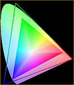 This is a chart of three different color gamut’s. The large horseshoe shaped area shows the LAB color space. This is the extent of human vision, so outside of this area human color vision comes to an end. The large open triangle shows the gamut encompassed by the ProPhoto RGB color space and the colored triangle shows that of Adobe RGB. The sRGB gamut is even smaller than that of the Adobe RGB color space and is used basically only for the Web. As you can see from this comparison chart, while the ProPhoto RGB color gamut encompasses more of the visible spectrum than Adobe RGB, it actually exceeds it in the deep greens and deep blues. What this means is that if you are using ProPhoto RGB as your working color space, it is possible for colors to be pushed into areas which can neither be seen nor reproduced, thus producing very nasty looking results within the visible spectrum. Yes, I found this online… click here for the full article.
Now you should be starting to see how many different things can influence your image and it’s final output. It really comes down to what you are going to do with the final product, but if you are planning on using it for more than one purpose, you need to be aware of how it will look on different output devices. Here is an example of what I am trying to explain in this posting.
Below you will see three thumbnails of the same picture… the difference between them is that they were edited on three different computers, with three different working color spaces, and three different monitor profiles. The funny thing is that all three of these images looked great on their respective monitors before uploading them to the Web. It is important to note that I did allow photoshop to convert these images to sRGB before uploading them.


[As-Shot sRGB Default Monitor Profile – ProPhoto RGB Monitor Profile – Photo LAB ICC Monitor Profile]
Let me try to explain what you are seeing. The image on the left was shot as a jpeg and imported into Adobe Lightroom with a sRGB color profile. I use this profile because I post my photos on the Web and the sRGB profile is compatible with most monitors and Web browsers. I then duplicated the image several times to make 4 copies and then closed the original so as not to change it by accident. I then resized the first copy, made a thumb and filed it for this Web page. So what you see on the left is the un-edited, as-shot original. I then converted the other three copies to my working color space (ProPhoto RGB) which I normally do for editing or if I intend to make prints.
I then closed all the images and reset my monitor profile from factory default to my working space default which is a calibrated variation of ProPhoto RGB. I then reopened the second image and made a small (10+) saturation adjustment to make it look like the first / original image. I then compared this copy with the first one which I had already uploaded to the Web for this journal entry/article. I then opened the third image on my other desktop computer that is calibrated and profiled for my professional print shops LAB color. In other words, the monitor for this computer is profiled to my print shop’s printing equipment so that when I edit images for prints, what I see is exactly what I get.
As stated before, the third image now looked drab and needed a large saturation adjustment (35+) in order for the colors to turn out correctly when printed. I then converted and uploaded this image as the third picture you see in my project. As you can see, the third image is highly over saturated and almost looks like something out of a science fiction movie, but keep in mind that on my profiled monitor it looks just like the second image in a Web browser. This whole issue comes down to this… If you edit your images on a monitor that is profiled for an output device that uses a larger color range than the sRGB color gamut of the Web, you should first be sure to convert your proofs to sRGB and then check them on another monitor before uploading them to the Web for online viewing. The other alternative is to send everyone whom you intend to have proof your images online a zip file with your monitor profile first, so that we can all be on the same page.
Sorry about the length of this rant, but this is a very complicated subject and not everyone see’s eye to eye on the issue. Just try to remember that if your pictures mean alot to you, then you should try to make them look their very best for everyone who views them, not just the people at your professional print shop… just a thought!!
:: Leave a Comment